Showing posts with label assessment. Show all posts

Tuesday, November 10, 2009

The Mornington Peninsula: lush and lovely

*This piece is written as a destination review for The Australian Travel Blog (http://blog.expedia.com.au/). The reviews are written by international travel bloggers.


There’s no doubt that Victoria’s hinterland boasts some of the loveliest and most diverse country in Australia. The landscape is full of sweeping vineyards, rugged mountains, rainforests, beaches and blue seas dotted with frolicking whales. The best news is that the Mornington Peninsula is just a one-hour drive from Melbourne’s CBD, so you can get there and back in a day and still experience some of the Peninsula’s fun (and delicious) activities.


View Larger Map

The Mornington Peninsula produces some of Australia’s finest wines, specialty beers and first-class gourmet food. The vineyards and breweries are run by friendly locals who will have a chat while guiding you through a tasting of their products. Most of the locations don’t charge for tastings and the owners will happily open an $80 bottle of award-winning Chardonnay just for you. Picturesque vineyards are often accompanied by Chef’s Hat restaurants (rated by The Age Good Food Guide) that base menus around produce grown in their own back gardens. All the vineyards are breathtakingly beautiful; here are some particularly eye-catching venues:


Montalto Vineyard and Olive Grove

The 35 acres at Montalto source premium cool climate wines and luscious olive products. Montalto’s crisp Chef’s Hat rated restaurant is acknowledged as the Peninsula’s best, while the adjoining piazza offers simple, tasty food for a reasonable price. You can explore the extensive kitchen garden and look around their permanent sculpture collection.


Red Hill Brewery

The owners of this unique micro-brewery cultivate their own organic hops field, all set in beautiful, rustic bushland. The brewery is open for public viewing and the bar is staffed by a charming expert who will get your taste buds tingling with a range of delicious hand-crafted ales. Watch out for their seasonal ale – this year was a superb “Temptation” brew with an appropriately wicked bite.


Photo by Steph Teh

Red Hill Estate

This multi-award winning estate has unrivalled views over Western Port Bay and Phillip Island. Max’s restaurant is the pioneer of winery restaurants on the Mornington Peninsula and the cellar door offers a sensational range of wines (tasting by appointment only). There is even luxury cottage accommodation for those who can’t bear to leave the spectacular venue.

The food and wine of the Mornington Peninsula can best be enjoyed by signing on with a guided tour. Wallaces’ Mornington Peninsula Winery Tours is run by local experts who will organise your trip and point out all the best places to visit. With someone else doing the driving, it will leave you free to indulge in that fine Shiraz, delectable Riesling or refreshing Pinot Grigio . . .

The Mornington Peninsula is home to a multitude of other activities – provided you don’t get too enthusiastic about the wines at the vineyards. For the adventurous, the Peninsula offers scuba-diving, surfing and deep-sea fishing, walking and bike tours. For those wanting a more relaxing holiday, there are horseback tours of the wineries and luxury cruises along the Peninsula’s coast. You can find all the information you need at Mornington Peninsula Tourism or the Visitor Information Centre at 359B Point Nepean Rd, Dromana VIC.

You can also find more fun things to do on the Mornington Peninsula and traveller reviews on Trip Advisor.


Filed under: Mornington Peninsula, Melbourne, Victoria, Australia, Wineries, Food

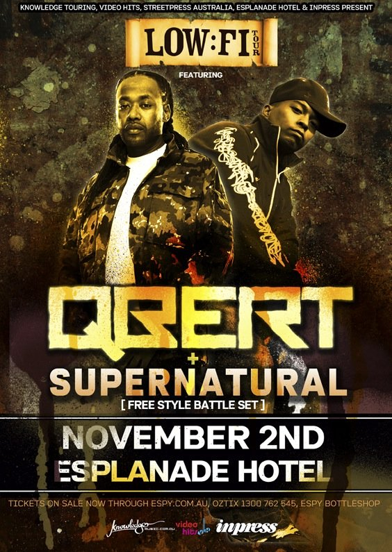
DJ Qbert and MC Supernatural at The Espy, Melbourne 02/11/09

*This piece is written for the “Concerts” category of an Australian music blog – TheMusicBlog.com.au. TheMusicBlog is a collaborative project that can be joined by anyone with an interest in the Australian music scene.


The undisputed kings of elemental hip-hop, DJ Qbert and MC Supernatural, were in full flow at The Esplanade Hotel last Monday night. Qbert, the world’s #1 turntabalist and two time US freestyle champion Supernatural ripped out a battle set never before seen in Australia as part of the Low-Fi Tour (also featuring Nas and Jurassic 5 front man, Chali 2na).

Qbert pioneered many of the popular scratching techniques used today and has appeared in countless tutorials for aspiring DJs. After three consecutive wins at the DMC world championships (1992–95) in team battles with Mix Master Mike, the organisers asked Qbert not to compete again in the hope of giving other DJs a chance at the title. Supernatural is equally legendary in the realm of freestyle emcee battles. He’s even in the Guinness World Records for the longest freestyle – over ten hours.

DJ M-Phazes kicked off the night with a few well-chosen hip-hop favourites, while Akil (J-5) followed with a set of gangsta beats from his upcoming album Sound Check and snippets of J-5 classics like “Freedom” and “I Am Somebody”. The absence of the main support acts The Funkoars, DJ Dexter (The Avalanches) and DJ Perplex was slightly puzzling, but not surprising – hip-hop artists are notoriously shocking at turning up for gigs.

Qbert needed no introduction as he appeared to ear-splitting whistles. He was characteristically calm as he politely asked the crowd if it would be “ok” for him to show off some scratching. The atmosphere was intense, with mad cheering interspersed with periods of utter silence as everyone fixated on Qbert’s fingers.

Supernatural joined Qbert for a few mildly disappointing R n B tunes sung slightly off-pitch. Singing obviously isn’t Supernatural’s forte, so when he opened his mouth to freestyle something wild poured out. People up-front handed him things from their pockets: lighters, bottles, wallets, phones, watches. Whatever they gave him, Supernatural spat a clever line or two before moving rapidly onto the next item. He kept this up for a good half hour, with Qbert grinning in the background. It was an amazing feat to witness live; you can see Supernatural doing a similar rap at the 2008 Magic Convention:


After Supernatural retired, Qbert started off his second suite with 1970s electronic beats, followed by an excellent break beat set. Even though Qbert had the audience rapt, he asked if it would be alright for him to fill in when the next DJ didn’t show up. It was heart-warming to hear the world’s best turntabalist as considerate and shy as if he were playing his first concert.

This great gig was made fantastic by humble performers who obviously loved what they were doing. It was impossible to be an unsatisfied hip-hop fan this night; these two artists are definitely worth seeing again. You can check out Qbert on his MySpace page or listen to some crazy freestyling on Supernatural’s.

The Espy Hotel has been putting on a fantastic show for Melbourne hip-hop enthusiasts – this year they’ve hosted big acts like the Gza and Ghostface Killah (Wu-Tang), Chali 2na, Akil and Labjacd. They’re even planning an ambitious Method Man and Redman concert in January 2010.

Tags: 2009, live, live music, hip-hop, review

Tuesday, October 13, 2009

Sci-Fi Acting is Dreadful: Make Everything Animation

(Written for the rant column of io9: science fiction website)

One of the frustrating things about science fiction films and television shows is that they’re often accompanied by bad acting. You would think that someone who’s gone to enough trouble to creating aliens, new world, galaxies, (if they’re not dead and they’re wives haven’t taken to producing instead) can take the time to find decent actors to fill the important roles.

This is likely impossible, as the over-cooked performances of Hayden Christensen and Natalie Portman (Star Wars), and the starry-eyed Daniel Radcliffe and Emma Watson (Harry Potter) can attest. There’s a simple solution: make everything into animation. It worked for the Clone Wars, it worked for Star Trek: The Animated Series, and it can work for all science fiction given a bad rep because of shoddy actors.

This isn’t saying that all sci-fi acting is crap; I could drool on about Ewan McGregor, Star Trek: The Next Generation’s Patrick Stewart and Brent Spiner’s unacknowledged brilliance playing Data. It’s the big-budget movies that tend to draw in the bad with the good: we saw it in Star Wars I – III with a sulky representation of Anakin Skywalker by Christensen and a pouting Portman as the regal, sharp-shooting Padmé Amidala. George Lucas would have been much happier with Anakin and Padmé in the Clone Wars—there, at least you can expect stiff-lipped facial expressions and wooden love scenes.


While Daniel Radcliffe managed to pull of a wide-eyed Potter and Emma Watson a particularly haughty Hermione, it’s hard to think these two actors were the cream of UK’s young aspiring. With one movie to go, the Potter rep has already been concreted: yep, the movies weren’t as good as the books. An animated Potter series could turn this on-screen stagnancy around. Magic and adventure has always had a fantastic animated screen presence, think 1977 The Hobbit or the 1967 Disney take on King Arthur, The Sword in the Stone. Here’s to hoping the planned 2011 release of a filmed Hobbit, produced by Peter Jackson and directed by Pan’s Labyrinth Guillermo Del Toro, can live up to the animated 70s classic.

In spite of being declared anathema by trekkies worldwide, I’ll put it out there that the acting in Star Trek: The Original Series wasn’t particularly first-rate either. Will Shatner’s cowboy cock-ups and beetling brows had to be offset with the warmly chaotic Jackson DeForest Kelley and a smattering of great acting from Leonard Nemoy. Star Trek: TOS and the movies starring original cast could have been bypassed with an animated Star Trek right from the beginning; that would take care of those pesky low-budget sliding doors and shaky cameras. Star Trek: TAS offered the writers far greater creativity and opportunities than the original live-action series. You can imagine that getting an animated humpback whale on board the Enterprise could be more convincing than it appeared in The Voyage Home.


Animated series can be just as successful in creating a sci-fi multiverse as live films—they’re blessedly free from bad acting and give a badass panache to phasers and lightsabers. There are so many possibilities still waiting for the animate world: just imagine an animated Picard rolling his R’s and sipping Earl Grey, or a lithely caricature of Sarah Michelle Gellar plunging stakes into dusky vampires.

SPANK ROCK & BENNY BLANCO are Bangers & Cash

WARNING: Explicit Material Following!!!
(Written as an album review for Rave Magazine Online)

(Downtown)
Hitting it fast and filthy

When an album opens with gongs and someone shouting “Welcome to the Fuck Shop”, followed by a dirty bass drop, you’d think you were in for a booty smacking, hoe tapping 2 Live Crew treat. But this is the start of Bangers & Cash, Spank Rock and producer Benny Blanco’s enthusiastic tribute to Miami ghetto bass and the spirit of old school nasty. Bangers & Cash is an E.P. that should be played full volume in the club, obnoxiously on your car stereo, or in the privacy of your bedroom if you’re too embarrassed for other people to hear Spank Rock spout you got “sweat drip from your cooch to your doodie hole”.

Bangers & Cash visits the sexually graphic genre pioneered by Miami’s 2 Live Crew, whose 1989 As Nasty As They Wanna Be
was banned straight off for being too explicit for U.S. citizens. For those too young to remember “Me So Horny”, Bangers & Cash provides enough potty-mouthed ghetto slang and gregarious sexuality to relive the forgotten forms of the early 90s “dirty rap” era.

The album stays true to the old style: the beats are bumping and Spank Rock’s use of “bitch”, “hoe” and “pussy” is certainly entertaining. But the EP lacks the effortless in yo’ face slap, the six-strong group mentality and the cultural significance of the 2 Live Crew’s mission to obscenity. Spank Rock’s geeky image doesn’t really work with Bangers & Cash; the songs call for a bit more muscle, and also a maturity that’s beyond the 21-year-old producer Benny Blanco.

We had a good taste of Spank Rock’s ingenuity and clever raps with YoYoYoYoYo, but Bangers & Cash falls short on originality. Whether this is a result of mimicking the 2 Live Crew or of following the signature formulas too closely, it means there are only two decent songs: the aptly named “B-O-O-T-A-Y” and “Loose”.

“B-O-O-T-A-Y” opens with a warning siren that gets the blood pumping. The driving RPM and Spank Rock’s rapid-fire delivery is reminiscent of YoYoYoYoYo’s “Rick Rubin” and Blanco slams in the bass with a synthesiser. Contrary to the rest of the E.P., Spank Rock spits some clever lyrics and is followed up with xxx rated feats from Black Betty and Santigold. The sexy guest raps from these two hip-hop ladies are a welcome respite from Spank Rock’s dirty mouthing and give “B-O-O-T-A-Y” a polish that’s lacking from other songs.

The bass hits even harder in “Loose”, which incorporates some classic hip-hop samples, an appropriately sassy rap from Amanda Blank and the dirty synthesiser that is Blanco’s love child for the rest of the E.P. In “Loose” Spank Rock lets us know he serves phallic for the most important meal of the day and makes it pretty clear what Bangers & Cash is all about: money, sex, booze, cocaine, the club and hoochie mamas.

***

Tuesday, September 1, 2009

Evaluating Web Writing: A Case Study of Three Online Music Magazines

Study 1: Rolling Stone

Rolling Stone is a music magazine that also covers politics, film, social issues, news and popular culture. It has a diverse audience who are interested in music (especially rock and roll) and popular culture; readers span all ages, from teenagers to 60+.

The homepage successfully produces the ‘alternative rock and roll’ feel of the Rolling Stone brand using bold red headlines and a white background. Research has shown that a particular typeface has a powerful effect on meaningful brand names and subsequent profit potential. Doyle and Bottomley noted that a product “with a congruent font…was more likely to be chosen for further investigation and for purchase than one that was presented in an incongruent font” (cited in Shaikh, Chapparo and Fox 2009, 1).

The homepage adopts an online newspaper format by using a vertical flow of text with information grouped by subject or idea into boxed portlets. News stories are presented prominently with bold headlines and kickers; each headline is a link to a separate page containing the full story. Good website design and information layout adds to Rolling Stones’ credibility. Morkes and Nielsen explained that “a website conveys an image, too. If it’s tastefully done, it can add a lot of credibility to the site” (1997, 5).

The homepage has many links to other news stories, photo galleries, blog archives and RSS feeds. Excluding advertisements, all links on the homepage are internal, except for links to Listen.com, a premium business partner that lists Rolling Stone as a recommended website, and Rhapsody, a subscription media player owned by Rolling Stone’s parent company All Media Guide.

The homepage prominently promotes the news story ‘Rivers Cuomo: We Ripped Off “The Sweater Song” From Metallica’ by using a bold headline, striking picture and brief kicker that are links to the storypage. The storypage can also be found by clicking on the ‘news’ tab on the top horizontal navigation bar and scrolling through an archive of recent articles. The storypage is easy to find and navigate to; the homepage successfully promotes the story through ease of user access.

Navigation around the storypage is easy as information is grouped into logical and manageable sections. All links contained within the news story lead internally to stories with related content and are used to provide readers with a background context for the story and additional information on the subject. Nielsen noted that “true hypertext should also make users feel that they can move freely through the information, according to their own needs” (1997, 4). These links encourage readers to explore the website and spend more time following threads of information according to their own needs and interest.

The news story and other content use a readable sans-serif typeface consistent with a newspaper style and use wide kerning and space between lines. Though the text alignment is un-justified, the lines of text are all of a similar length within the portlet; this increases the story’s readability.

The story is written in an ‘inverted pyramid’ format that presents important information first. Jakob Nielsen noted several user studies confirmed the effectiveness of the inverted pyramid style, as users tended to read only the first part of an article and did not enjoy scrolling through long texts (cited in Pack 2000). The story is ‘chunked’ into short paragraphs with clear topic sentences. This logical division of information aids reader retention and ease of scanning the article for key points. The story is written using simple language that is credible in its professionalism.

The headline stands out from other text on the storypage and picks up all the keywords in the article. While these keywords are successfully integrated in the story through repeated use and hyperlinks, they are not utilised for ‘tags’.

The large action photograph of Rivers Cuomo is striking and relevant to the news story. The picture is aesthetically effective as it mirrors the red colour scheme of Rolling Stone and adds to the overall harmony and credibility of the storypage.

A commentary/feedback section invites reader discussion and increases user-activity and interest in the website. This aids in a sense of community and shared values for the Rolling Stone brand and makes the story seem in the ‘public interest’. However, it is noted that Rolling Stone often deletes, revises and omits the commentary section from the website (Wikipedia 2009)

Study 2: Mojo (The Music Magazine)

Mojo was founded in 1993 and is printed monthly in the UK. Mojo has been noted for its in-depth knowledge of classic rock and coverage of lesser-known ‘left-field’ bands (Wikipedia 2009). Mojo primarily targets a British audience and is aimed at a younger demographic than Rolling Stone: an estimated reader age-span between 13-30 years.

Mojo online has chosen similar token colours to Rolling Stone, with a nominal black, white, and red scheme to give a modern ‘edgy rock’ feel. The homepage has a roughly vertical text-flow with portlets of content. It is graphic intensive, with colour-heavy banner links to articles and flashing text. The homepage is crammed with content and uses a small font which is difficult to read. News stories are presented most prominently in the top left-hand corner of the page, with each story containing a headline, kicker and picture linked to a separate storypage. The busy design and clustered organisation of content makes the homepage less readable and more frustrating to navigate than Rolling Stone.

The homepage has links to news stories, feature articles, internal blogs, and actively promotes merchandise and magazine subscription. The website features links to Aloud.com, an affiliated ticketing company owned by Mojo’s parent company, Bauer Media.

The homepage displays the news story ‘Ralfe Band Get In On The Abbey Road Act’ prominently, but readers are easily distracted by the larger graphics and flashing text of other content. The storypage can be easily found using the ‘news’ tab on the top horizontal navigation bar and scrolling down an archive list.

The storypage contains less content and fewer distracting graphics than the homepage, which aids navigation and emphasises use of the top navigation bar. Two links within the news story are used to promote the Ralfe Band and their singer Oly Ralfe: one link to the Ralfe Band’s MySpace page and another to Oly Ralfe’s personal project. The links are incorporated clumsily into the text, using the words ‘right here’ as the hypertext link and ambiguously using ‘AJ Webermen’ as the hypertext for Oly Ralfe’s documentary. An imbedded YouTube video further promotes the band and provides background context for the story. The use of external links to YouTube, MySpace and an external website signifies Mojo is willing to use free content as well as internal content that will promote the Mojo brand and products. Prominent links to RSS feeds to Digg, Reddit, Facebook and Delicious are successful in promoting Mojo brand and products.

The news story uses a legible sans-serif typeface, but lacks space between letters, lines and paragraphs. The story is written in a ‘hip’ style and is full of music jargon and pop-culture references that disrupt the flow of the story and makes text-scanning impossible. Kissane (2008) wrote, “there’s a time for professional jargon: when you know you’re speaking to an audience that understands you, and you need the extra specificity and precision that jargon can provide. If you’re using it outside of that situation, you’re probably not communicating clearly, honestly, or effectively.”

Logical idea progression and topic sentences are missing from the story and make it frustrating and annoying to read. Pack (2000) noted that “Web users are busy; they want to get the straight facts… credibility suffers when users clearly see that the site exaggerates.” The story loses credibility using unnecessary jargon.

Keywords are used ineffectively in the story or throughout the storypage. The headline uses only two key phrases ‘Ralfe Band’ and ‘Abbey Road’, which are not emphasised during the story. The tagged word ‘Beatles’ links to a search engine that draws up a good selection of related stories, but a ‘Ralfe Band’ search produces no other content.

Study 3: Mess+Noise

Mess+Noise is an Australian music community website that produces a print magazine. The target audience of Mess+Noise is young adults interested in local (Melbourne-focused) music and artists.

The homepage is simply designed and uses a vertical, column format. White space and an uncomplicated colour scheme make the homepage easily navigable. Information is logically represented under well-defined categories; the homepage displays boxed graphics and content grouped by bullet points under subheadings. The simplicity of design and colour scheme make the homepage seem ‘empty’ and gives the impression Mess+Noise is more amateur than Rolling Stone and Mojo.

The homepage promotes links to internal stories, reviews, event schedules, film clips, discussion boards and ticketing and does not emphasise Mess+Noise products as powerfully as Rolling Stone or Mojo. The homepage actively promotes the news story ‘Songs On The Road’ by using a large picture and headline. The story is easily found within ‘music news’ under the ‘features’ tab in the top navigation bar.

The storypage reiterates the simple design and ease of navigation evident on the homepage. The storypage is light on content – it contains only the story, a comments section and a side-bar of similar news stories and updates. The story contains only one internal link to ‘Spring Tones’, a music festival organised by Mess+Noise.

The tag ‘songs’ is too ambiguous and the linked search engine pulls up pages of unrelated material. Promotion of Mess+Noise is successfully integrated in the ‘share’ tab on the top of the storypage: it links to over 50 social networking websites, email and news websites, which encourages readers to share Mess+Noise information.

The news story and other content use a serif typeface that is easy to read. The story is written in a conversational tone that builds a sense of casual acquaintance and reinforces Mess+Noise’s community-based values. The story is logically chunked, but the subheading ‘Songs On The Road’ (the same as the headline) is confusing and disconnected from the following event schedule. The content of the story is easily readable, but is spoiled by too many hyphens in the first paragraph.

The story headline could be better worded to avoid ambiguity and could stand out more from other text. The headlines does not pick up the keywords ‘travel’, ‘tour’ or ‘new album’ from the story. Keywords are not used to full potential to link readers to relevant information. The unattractive photograph of band ‘Songs’ is not effective in promoting the story and the red/pink curtain background draws the eye away from story content.

The comments section lends Mess+Noise a credibility that is lacking from the absence of links and related content. The commentators seem casually familiar with each other and follow discussion threads. Wardrip-Fruin said “the ability to interact with a text seems much greater on the part of those who have written-and those, of course, who have some of its subject and tools for analysis” (1996, 357). This interactivity is especially important considering Mess+Noise’s audience and aim to create an online community.

Conclusion

Rolling Stone produced the most positive response in optimisation of content to the online environment. The homepage and storypage design are effective and navigable, the writing style professional and the story format easily readable. Rolling Stone is most effective in promoting a brand-name and a ‘feel’ for readers, encouraging readers to spend more time on the website, and cross-promoting related content through links.